Graphic Design
Avessa
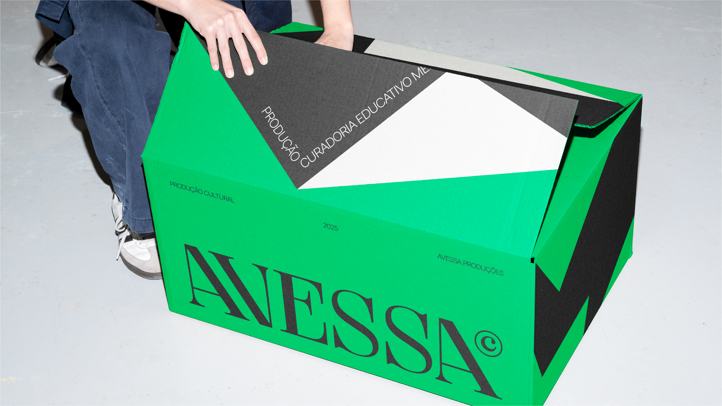
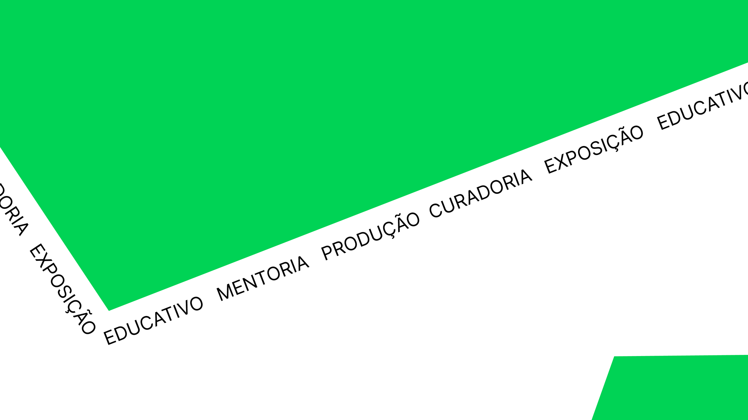
Avessa’s visual identity emerges from the contrast between the ordinary and the unexpected. The name itself, which suggests the act of looking at the reverse, the other side, is translated into a graphic language marked by tension: asymmetric geometric forms that fold and transform, creating planes that evoke the idea of multiple perspectives. The identity reflects the multifaceted nature of the producer—production, curation, education, and mentorship appear as key concepts that are graphically reconfigured, just like Avessa’s projects, which adapt according to context and audience.
Porto Alegre, Brazil
2025
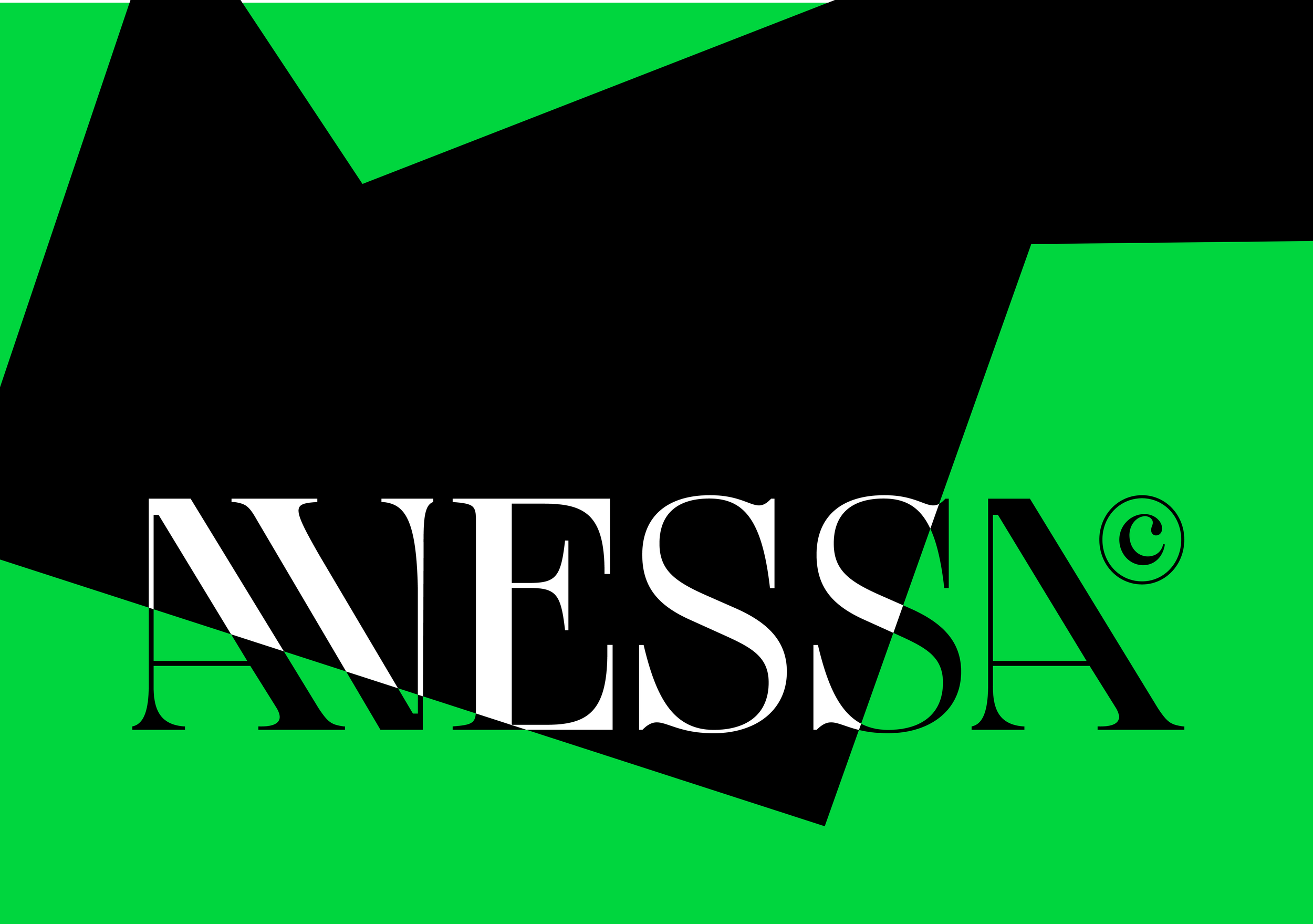
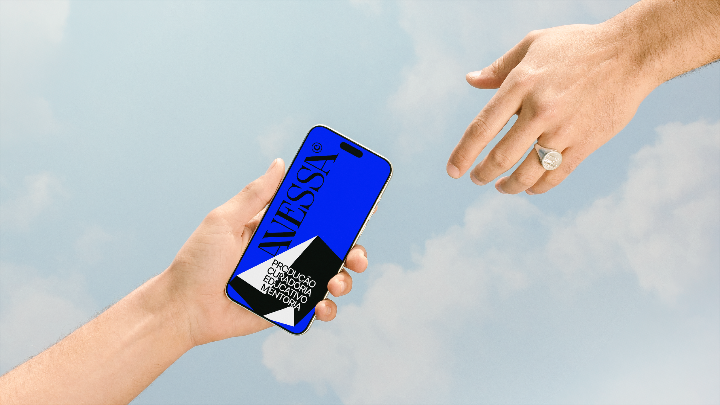
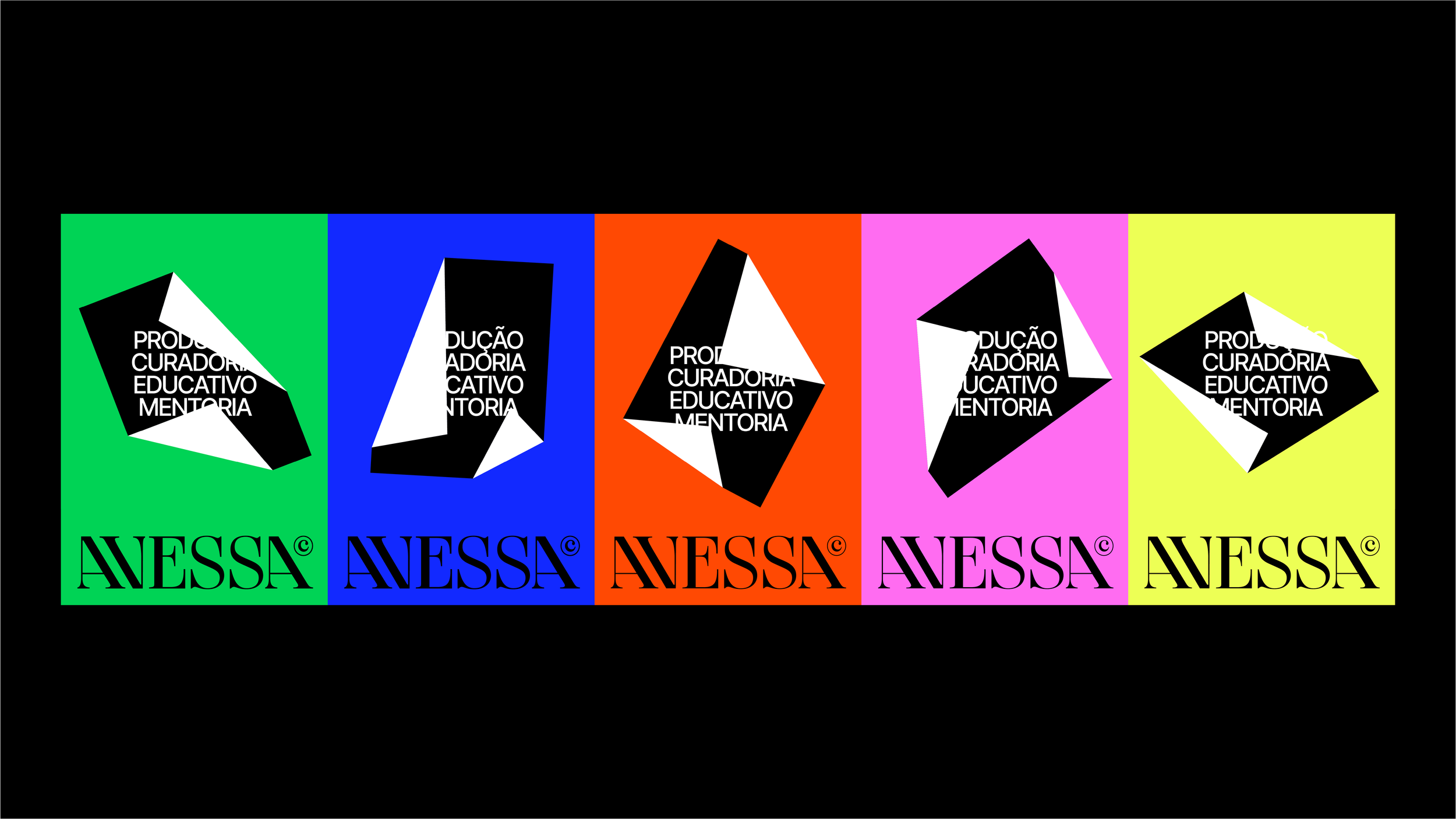
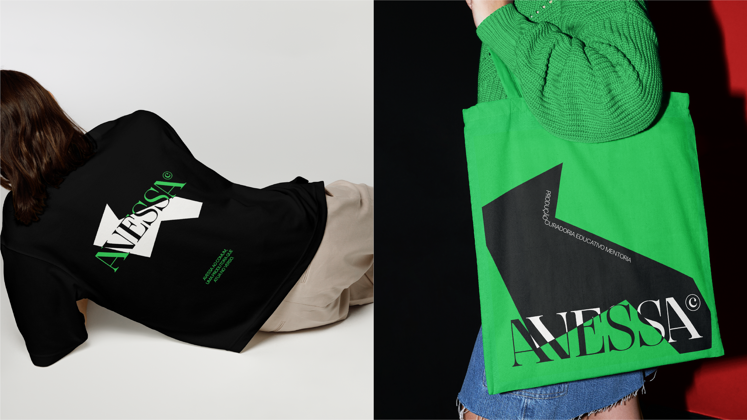
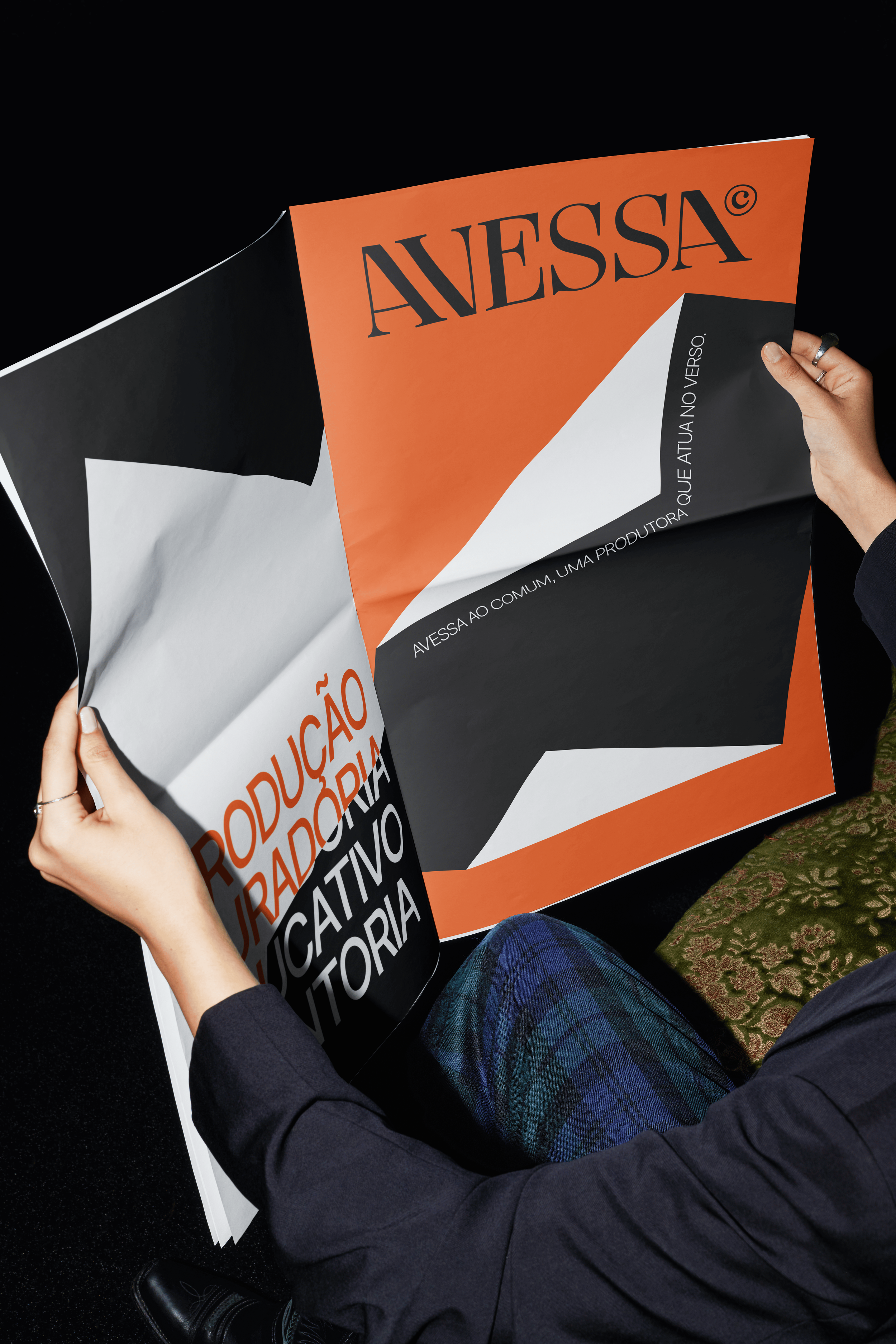
The vibrant colors engage with the diversity and dynamism of the cultural practices promoted by Avessa, while the elegant, strong typographic presence contrasts with geometric rigidity, reinforcing the power of the name as a visual signature.
The movement of text flowing through the forms conveys the essence of motion and integration that defines the producer’s relationship with cultural projects and the people impacted by its initiatives.