Graphic Design
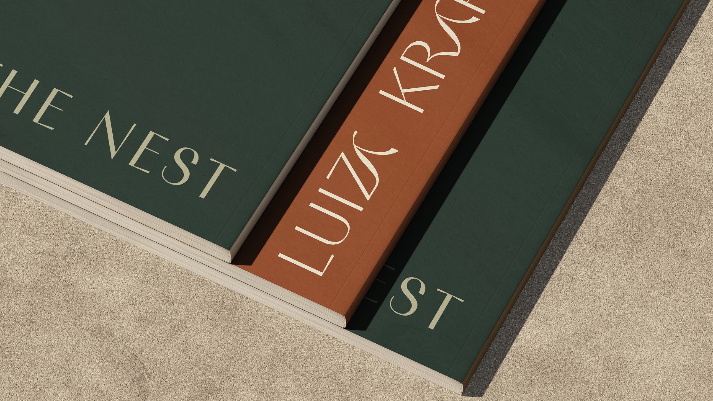
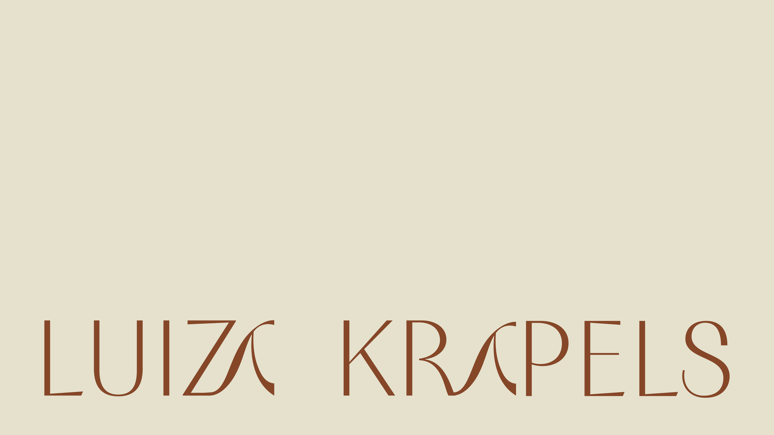
Luiza Krapels
Luiza Krapels’ personal brand was developed to communicate her work as a psychologist and holistic therapist, guiding individuals on a journey of self-knowledge. The visual language for Luiza Krapels is established as a reflection of care and attentive listening, creating a visual presence that inspires trust, serenity, and purpose.
San Francisco, USA
2025


The “LK” monogram is the core of the identity, featuring fluid lines that evoke the movement of water and the flow of life. This organic form represents the flexibility and transformation inherent to the therapeutic process


Graphic Design
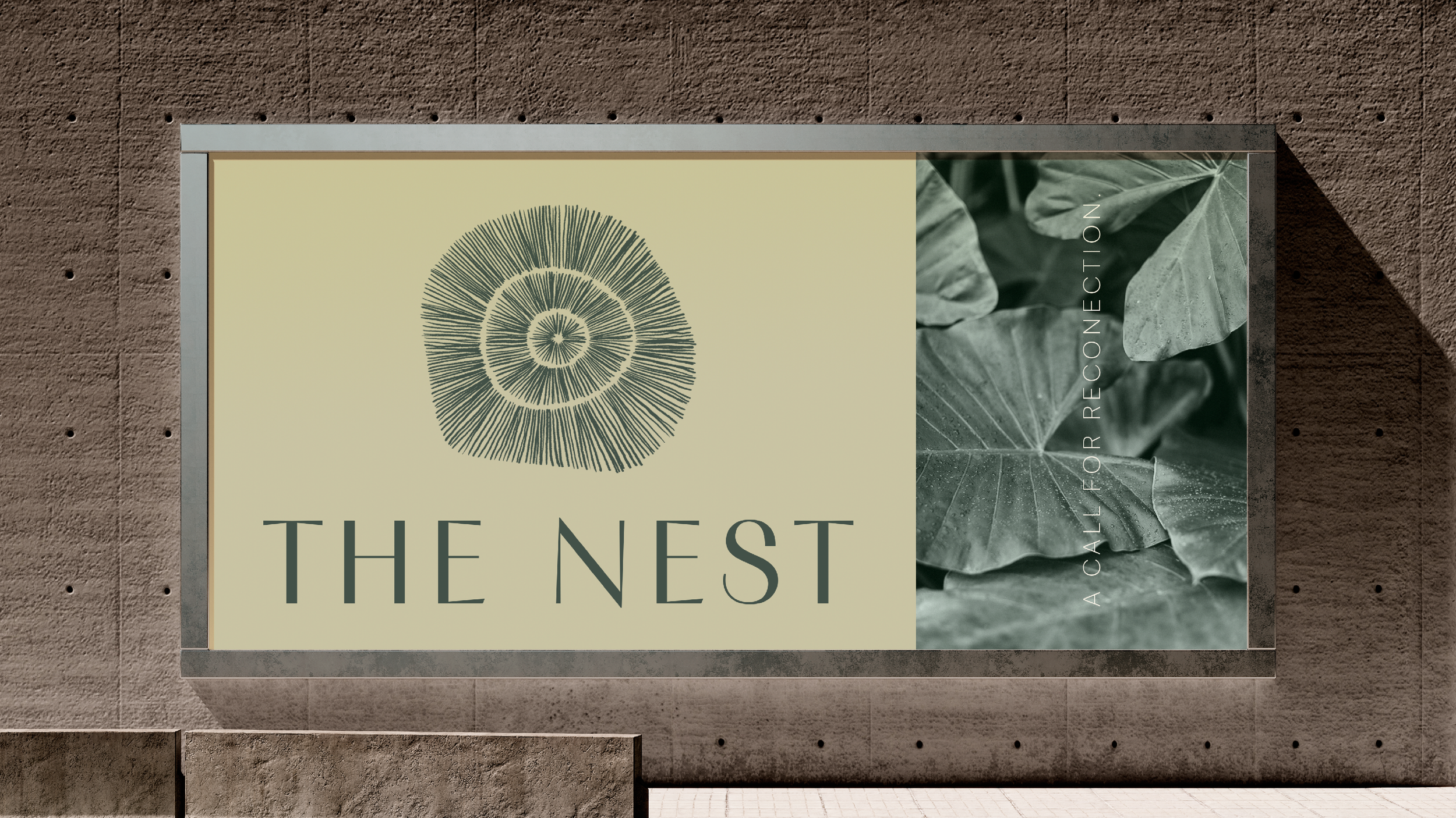
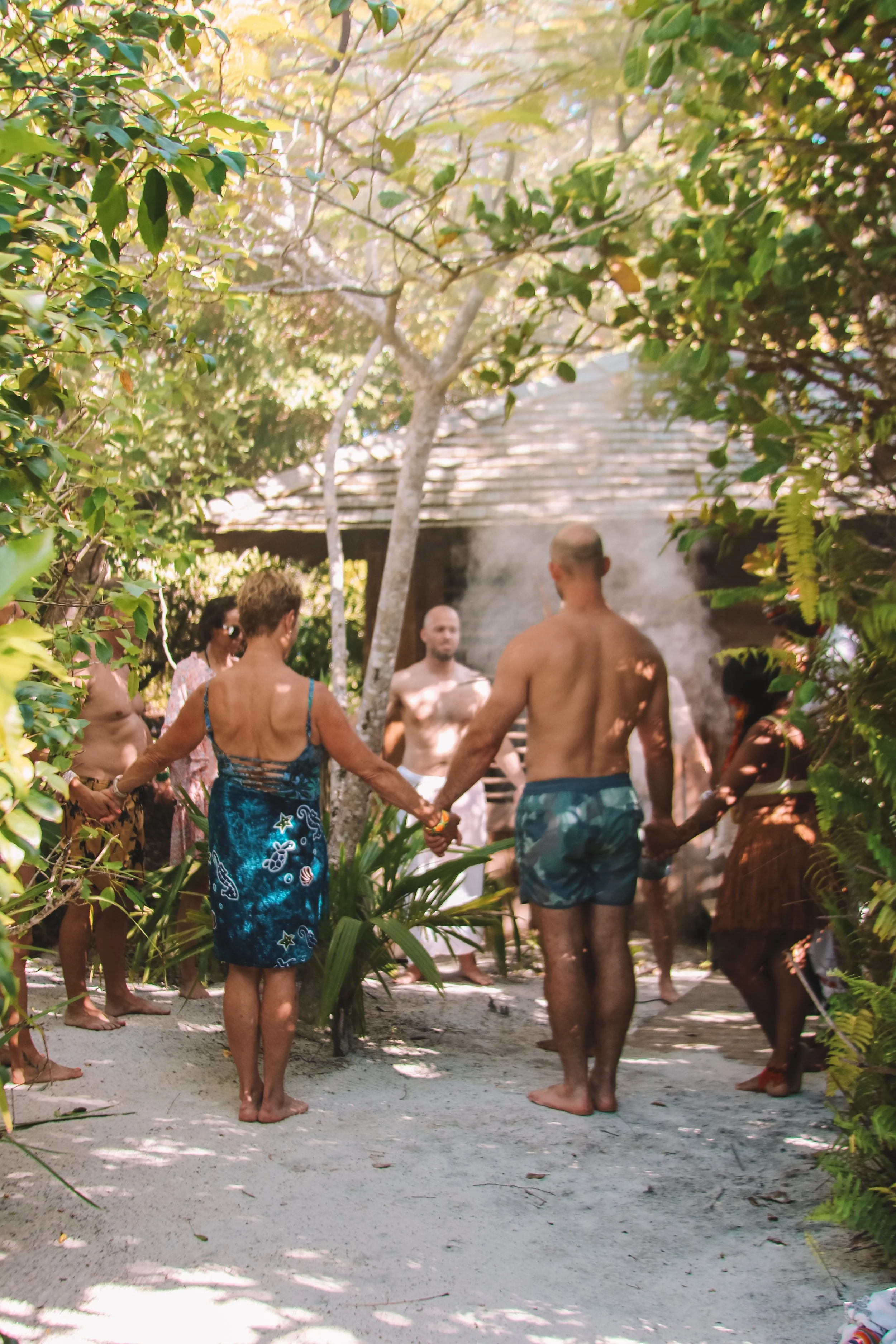
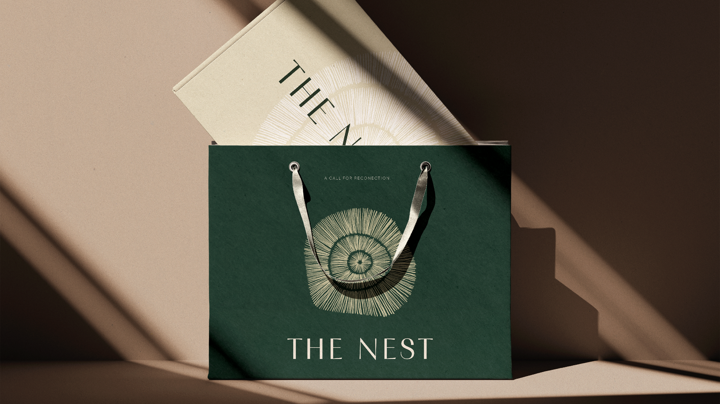
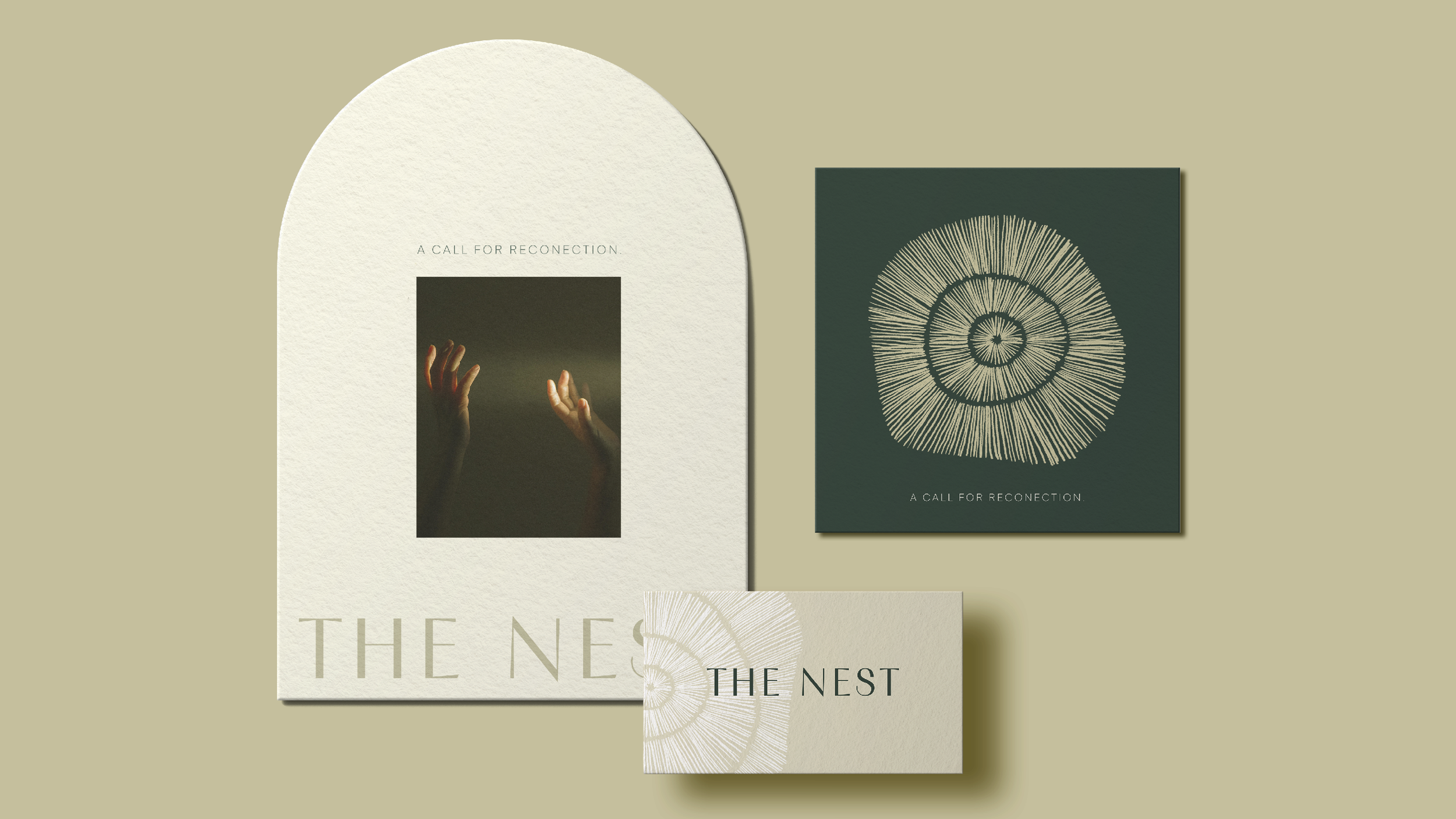
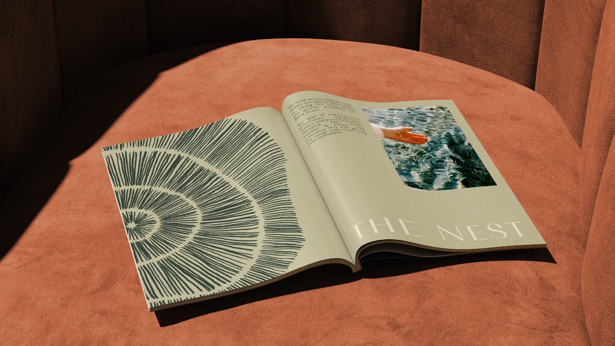
The Nest
The visual identity of The Nest is rooted in the concept of reconnection with nature. The central symbol is inspired by the concentric forms of a tree’s growth rings, evoking cycles, time, and regeneration. Organic, delicate, and radial lines convey movement, expansion, and depth, inviting contemplation. The color palette combines earthy tones and deep greens with light neutrals, creating a serene and sophisticated atmosphere. This chromatic choice reinforces the connection to the natural world and suggests a sense of shelter and stability. Together, the identity translates a call for inner reconnection, reinforced by the tagline: A call for reconnection.
Los Angeles, USA
2025